Beam’s new product homepage
Before our new homepage, every time you returned to Beam, you were immediately dumped into the web analytics view. This had the advantage that you would hopefully be getting value straight away from the product. But having a homepage like this meant there were a lot of limitations with our product.
Limitation 1: What if I have multiple domains?
A number of our users use Beam for multiple domains. So when they are dumped into the main analytics view, it was showing data for all their domains aggregated together. As an example, we were using Beam for three domains - the late Flurly.com, beamanalytics.io and graphjson.com. And there were a bunch of testing environments too that were getting mixed in.

So if a user just wanted one domain, they’d have to click on one of the domains to create a filter. Below is the data just filtered for Beam. But this wasn’t a long term solution. Every time they returned, they’d have to do this. And that is very annoying.

Limitation 2: Can I create and save funnels?
Before the new homepage, the short answer was no. You’d go create a funnel, look at the data, and when you returned the next time, that funnel would be gone. You couldn’t save it. And there was no way to create multiple funnels at a time. We were telling people that if they wanted to ‘save’ a funnel, they could bookmark the page. Again, a bad hack that wasn’t a long term solution.
Limitation 3: How do I add an extra domain? Or an extra teammate?
We’d added the ability for users to use Beam for multiple domains. And we’d also had a ‘teams’ feature where teammates could be added. But these were badly hidden under the profile. As some of our users told us, not the most intuitive place to put it! So as users kept asking if it was possible to add more domains or teammates because they couldn’t find it in the product, we knew we needed to change this.

Limitation 4: Can I use Beam to create custom events?
Here was another issue with our product! We had added this feature after launch, but few people knew about it. And there was no way to find out about it in the product. We had written a blog post about it so were linking people who were asking about it. But it wasn’t exactly easily found! We had to find an easier way to let people know this was possible.
So what did we do?
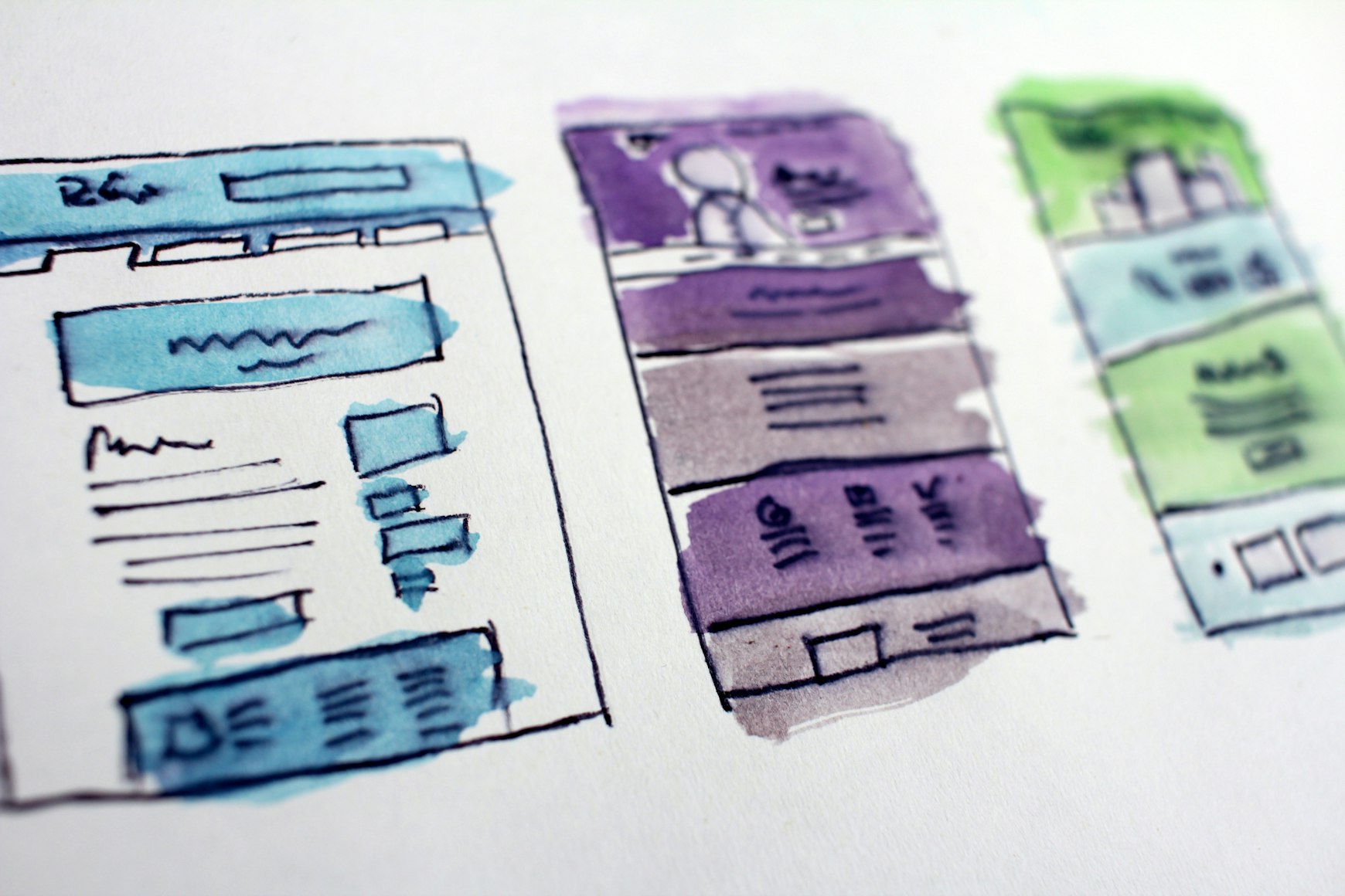
JR and I are the first to admit we’re not designers. But we appreciate great design and think it’s critically important. As you can see with our landing page, we’re big believers in using templates and copying good patterns. It gives the product a decent level of polish, but doesn’t bog us down in design issues we’re just not capable of resolving.
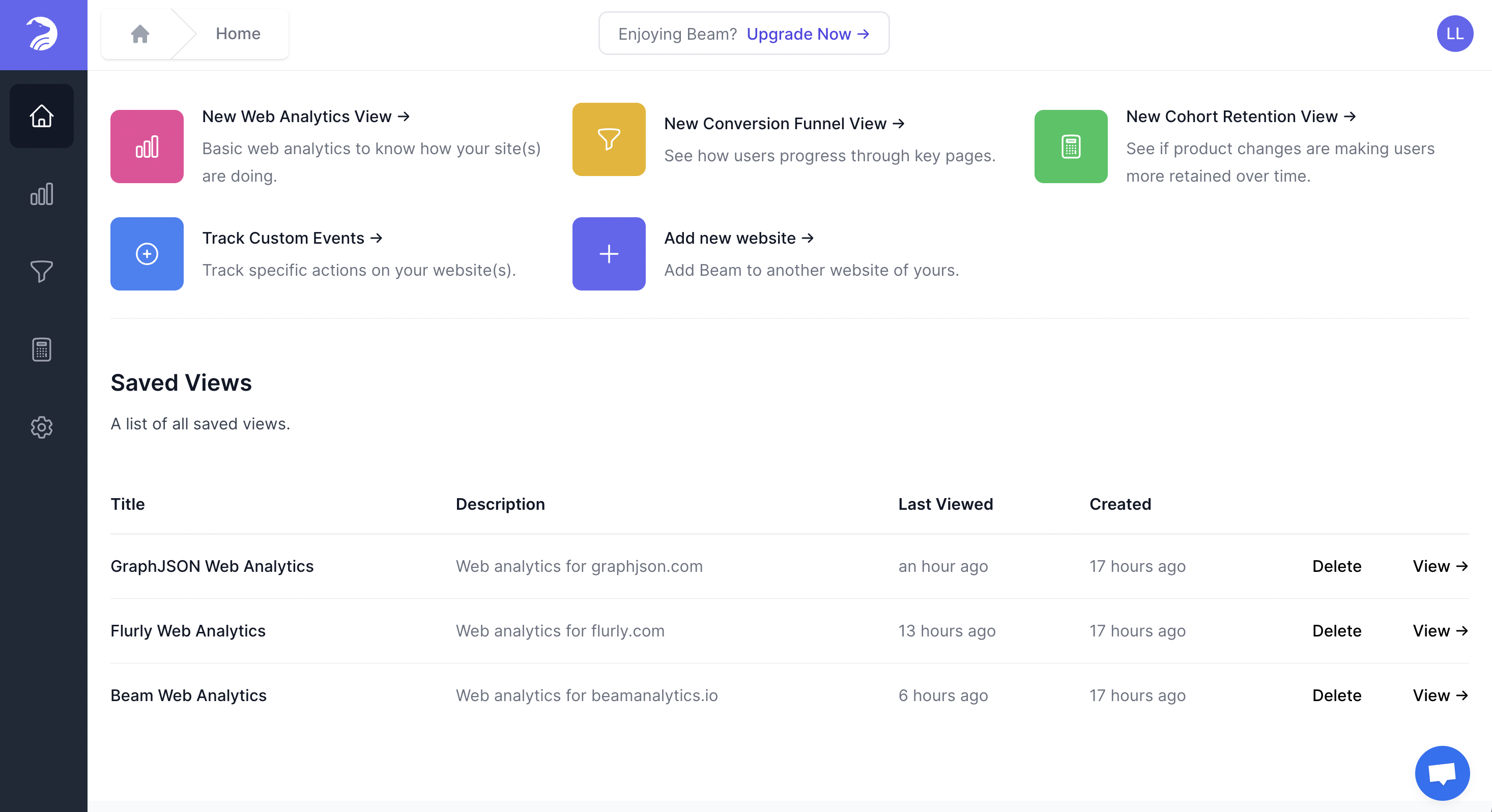
We spoke to a number of users about our ideas, and even shared our product requirement document (PRD) with many of them. We’re very grateful for the comments and suggestions wer received. For the homepage, we patterned it on Figma’s homepage. The left hand side is the knowledge base and information about which plan you’re on. We don’t have this yet but will be adding it soon.

For the main part, we only borrowed the top and bottom parts. At the top is where we encourage users to take a new action:
- Create a new web analytic view - so this is where you can filter to just one out of your many domains, and then save this view
- New conversion funnel view - create and save multiple funnels. You’ll never have to repeat yourself again
- Track custom events - it’s possible! The tile will link you to our blog post which explains how easy it is to do
- Add a new website - add more domains
We’ll soon have ‘add a teammate’ in the left hand panel when we update that section.
At the bottom is a list of all the saved views. Right now, this bottom section is just an ugly list so we could ship things faster. But in time, we’ll tidy that up and make it into nice looking tiles. And so this is the current state of our new product homepage.

Let us know what you think @beamanalyticsIO or email us at hi@beamanalytics.io. As always, appreciate your time!